Data Visualisation
Most of you, if not all, would be familiar with creating the graphs in Excel. Software such as Excel has a predefined set of menu options for plotting the data that is the focus of the end result: “pretty graph”. Those types of menus assume data to be in a format ready for plotting, which when you get raw data is hardly the case. You are probably going to have to organse and wrangle your data to make it ready for effective visualisation.
Grammar of Graphics
The grammer of graphics enables a structured way of creating a plot by adding the components as layers, making it look effective and attractive.
It enables you to specify building blocks of a plot and to combine them to create the graphical display that you want. There are 8 building blocks:
data
aesthetic mapping
geometric object
statistical transformations
scales
coordinate system
position adjustments
faceting
Imagine talking about baking a cake and adding a cherry on the top. 🎂🍒 This philosophy has been built into the ggplot package by Hadle Wickham for creating elegant and complex plots in R.
ggplot2
Learning how to use the ggplot2 package can be challenging, but the results are highly rewarding and just like R itself, it becomes easier the more you use it.
The best way to master it is by practising. So let us create a first ggplot. 😃
What we need to do is the following:
- Wrangle the data in the format suitable for visualisation.
- “Initialise” a plot with
ggplot() - Add layers with
geom_functions
# load the packages
suppressPackageStartupMessages(library(dplyr))
suppressPackageStartupMessages(library(gapminder))
suppressPackageStartupMessages(library(ggplot2))
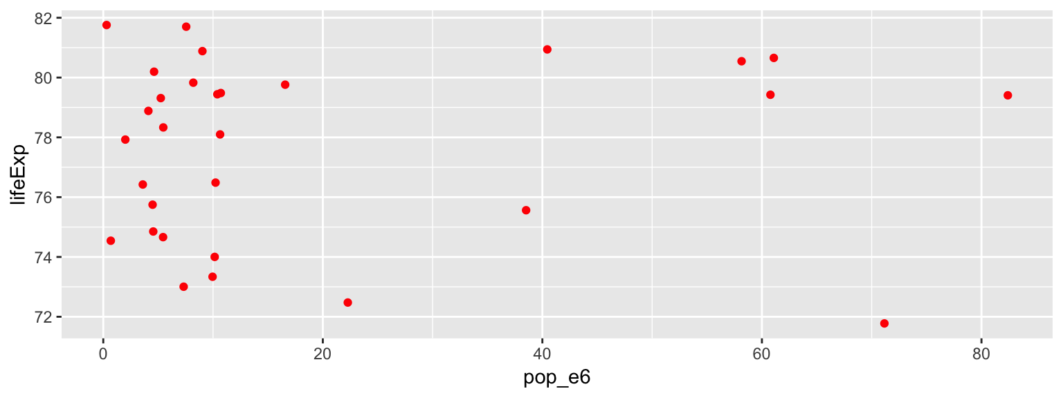
# wrangle the data (Can you remember what this code do?)
gapminder_pipe <- gapminder %>%
filter(continent == "Europe" & year == 2007) %>%
mutate(pop_e6 = pop / 1000000)
# plot the data
ggplot(gapminder_pipe, aes(x = pop_e6, y = lifeExp)) +
geom_point(col ="red")
🤓💡 Tip: You can use the following code template to make graphs with ggplot2:
ggplot(data = <DATA>, (mapping = aes(<MAPPINGS>)) + <GEOM_FUNCTION>()
ggplot() gallery
Run the following code to see what graphs it will produce.
ggplot(data = gapminder, mapping = aes(x = lifeExp), binwidth = 10) +
  geom_histogram()
#
ggplot(data = gapminder, mapping = aes(x = lifeExp)) +
  geom_density()
#
ggplot(data = gapminder, mapping = aes(x = continent, color = continent)) +
  geom_bar()
#
ggplot(data = gapminder, mapping = aes(x = continent, fill = continent)) +
  geom_bar()
🗣👥 Confer with your neighbours:
Does the life expectancy depend upon the population size?
y = b_0 + b_1 x + e
Run this code in your console to fit the model pop vs lifeExp.
Pay attention to spelling, capitalization, and parentheses!
m1 <- lm(gapminder_pipe$lifeExp ~ gapminder_pipe$pop_e6)
summary(m1)
Can you answer the question using the output of the fitted model?
m1 <- lm(gapminder_pipe$lifeExp ~ gapminder_pipe$pop_e6)
summary(m1)
##
## Call:
## lm(formula = gapminder_pipe$lifeExp ~ gapminder_pipe$pop_e6)
##
## Residuals:
##    Min     1Q Median     3Q    Max
## -6.324 -2.562  1.007  2.245  4.277
##
## Coefficients:
##                        Estimate Std. Error t value Pr(>|t|)
## (Intercept)           77.477421   0.721723 107.351   <2e-16 ***
## gapminder_pipe$pop_e6  0.008762   0.023779   0.368    0.715
## ---
## Signif. codes:  0 '***' 0.001 '**' 0.01 '*' 0.05 '.' 0.1 ' ' 1
##
## Residual standard error: 3.025 on 28 degrees of freedom
## Multiple R-squared:  0.004826,	Adjusted R-squared:  -0.03072
## F-statistic: 0.1358 on 1 and 28 DF,  p-value: 0.7153
👉 Practice ⏰💻: Use gapminder data.
Does the life expectancy depend upon the GDP per capita?
1) Have a glance at the data. (tip: sample_n(df, n))
2) Produce a scatter plot: what does it tell you?
3) Fit a regression model: is there a relationship? How strong is it? Is the relationship linear? What conclusion(s) can you draw?
4) What are the other questions you could ask; could you provide the answers to them?
😃🙌 Solution: code Q1; sample
sample_n(gapminder, 30)
## # A tibble: 30 x 6
##    country       continent  year lifeExp      pop gdpPercap
##    <fct>         <fct>     <int>   <dbl>    <int>     <dbl>
##  1 Iraq          Asia       1962    51.5  7240260     8342.
##  2 Austria       Europe     1972    70.6  7544201    16662.
##  3 Cote d'Ivoire Africa     1977    52.4  7459574     2518.
##  4 Vietnam       Asia       1992    67.7 69940728      989.
##  5 Swaziland     Africa     1967    46.6   420690     2613.
##  6 Australia     Oceania    1987    76.3 16257249    21889.
##  7 Netherlands   Europe     1987    76.8 14665278    23651.
##  8 Ecuador       Americas   1977    61.3  7278866     6680.
##  9 Tanzania      Africa     2002    49.7 34593779      899.
## 10 Tunisia       Africa     1987    66.9  7724976     3810.
## # … with 20 more rows
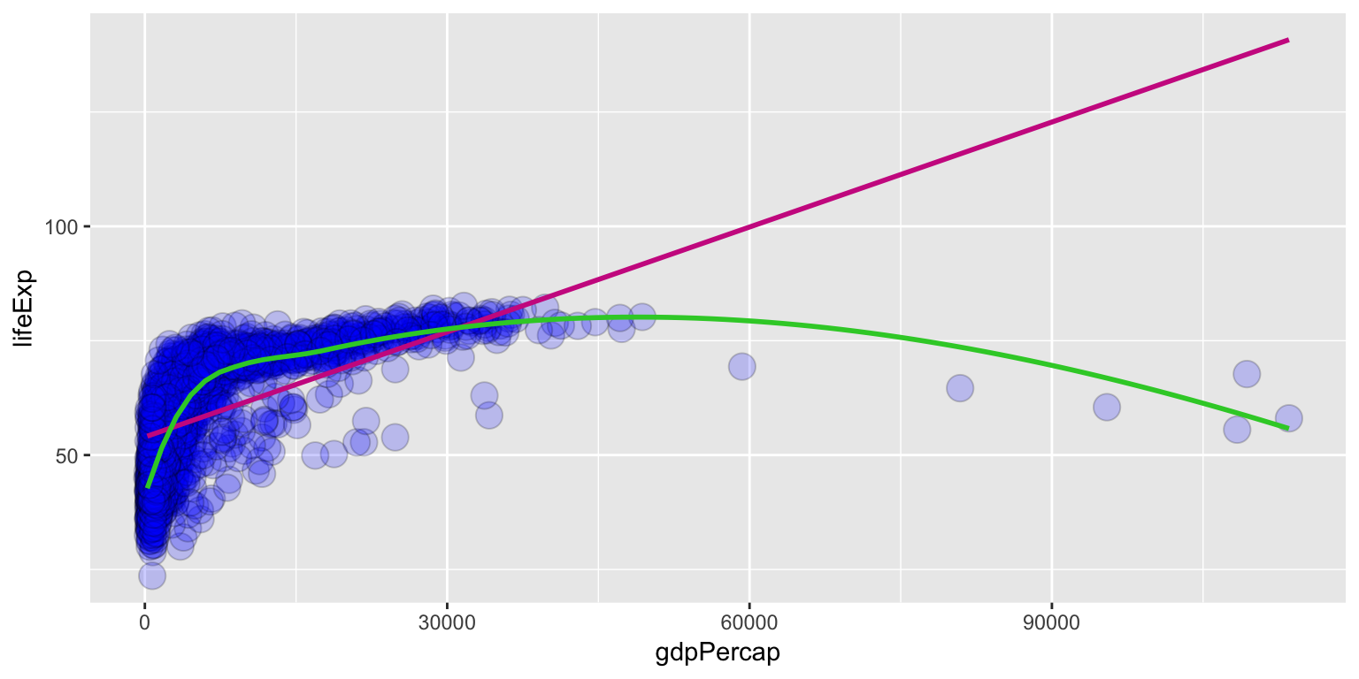
😃🙌 Solution: code Q2; Plot the data;
ggplot(gapminder, aes(x = gdpPercap, y = lifeExp)) +
    geom_point(alpha = 0.2, shape = 21, fill = "blue", colour="black", size = 5) +
  geom_smooth(method = "lm", se = F, col = "maroon3") +
  geom_smooth(method = "loess", se = F, col = "limegreen")
😃🙌 Solution: code Q3; simple regression model
my.model <- lm(gapminder_pipe$lifeExp ~ gapminder_pipe$gdpPercap)
summary(my.model)
##
## Call:
## lm(formula = gapminder_pipe$lifeExp ~ gapminder_pipe$gdpPercap)
##
## Residuals:
##      Min       1Q   Median       3Q      Max
## -2.79839 -1.30472  0.00807  1.33443  2.87766
##
## Coefficients:
##                           Estimate Std. Error t value Pr(>|t|)
## (Intercept)              7.227e+01  6.942e-01 104.113  < 2e-16 ***
## gapminder_pipe$gdpPercap 2.146e-04  2.514e-05   8.537  2.8e-09 ***
## ---
## Signif. codes:  0 '***' 0.001 '**' 0.01 '*' 0.05 '.' 0.1 ' ' 1
##
## Residual standard error: 1.598 on 28 degrees of freedom
## Multiple R-squared:  0.7225,	Adjusted R-squared:  0.7125
## F-statistic: 72.88 on 1 and 28 DF,  p-value: 2.795e-09
Adding layers to your ggplot()
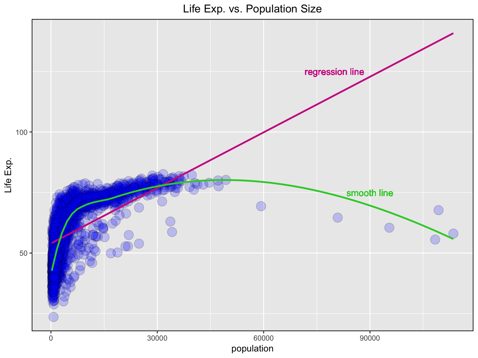
💪 There is a challenge:
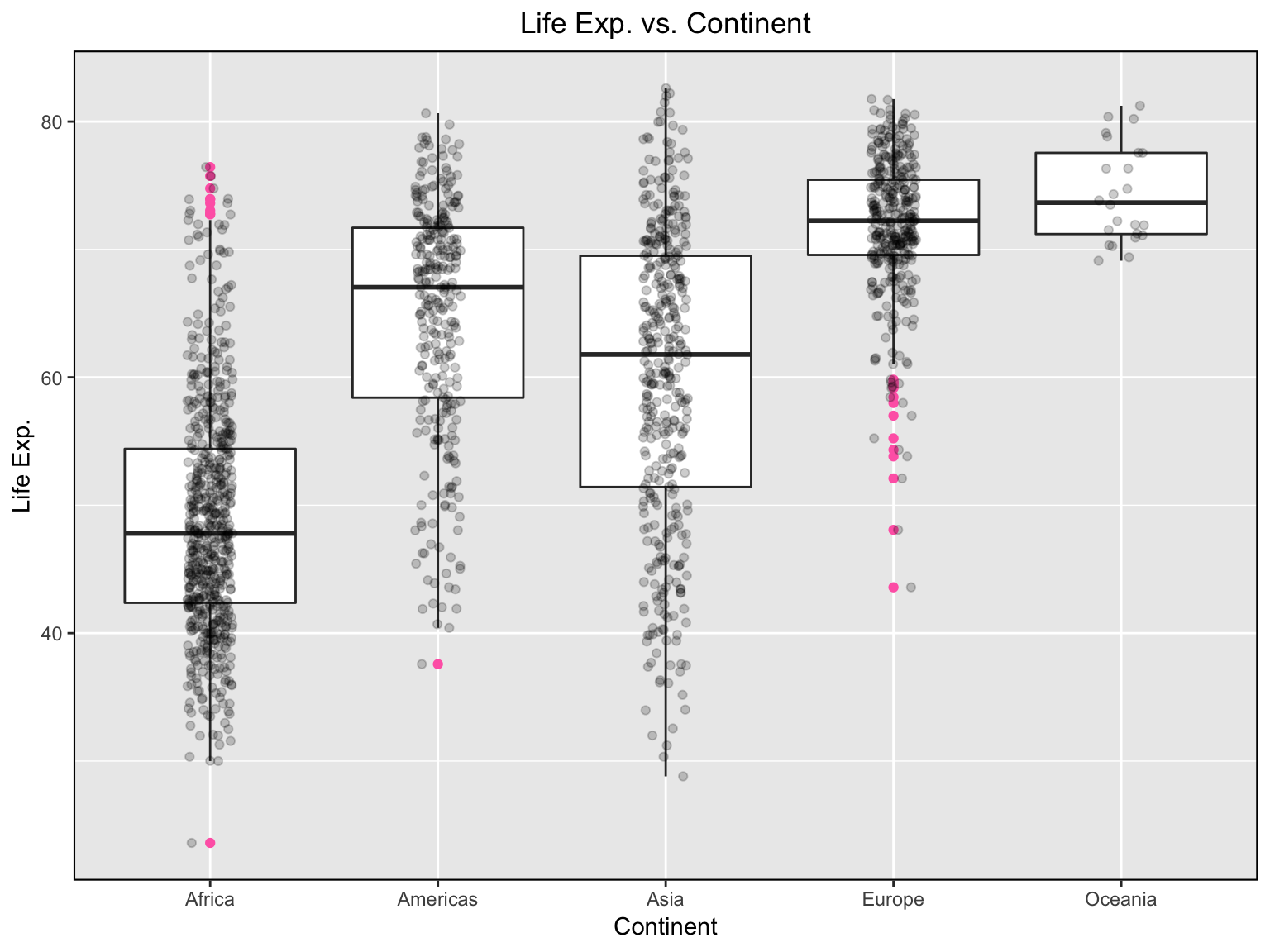
dplyr’sgroup_by()function enables you to group your data. It allows you to create a separate df that splits the original df by a variable.boxplot()function produces boxplot(s) of the given (grouped) values.
Knowing about group_by() and boxplot() function, coud you compute the median life expectancy for year 2007 by continent and visualise your result?
😃🙌 Solution: code
Let us look at the median life expectancy for each continent
gapminder %>%
    group_by(continent) %>%
    summarise(lifeExp = median(lifeExp))
## # A tibble: 5 x 2
##   continent lifeExp
##   <fct>       <dbl>
## 1 Africa       47.8
## 2 Americas     67.0
## 3 Asia         61.8
## 4 Europe       72.2
## 5 Oceania      73.7
We are lucky that we live in Serbia, ie. Europe!!! 😅
😃🙌 Solution: graph
useful links:
tidyverse, visualization, and manipulation basics
Introduction to R graphics with ggplot2
An example from Financial Times
BBC Visual and Data Journalism cookbook for R graphics
© 2019 Tatjana Kecojevic